Background
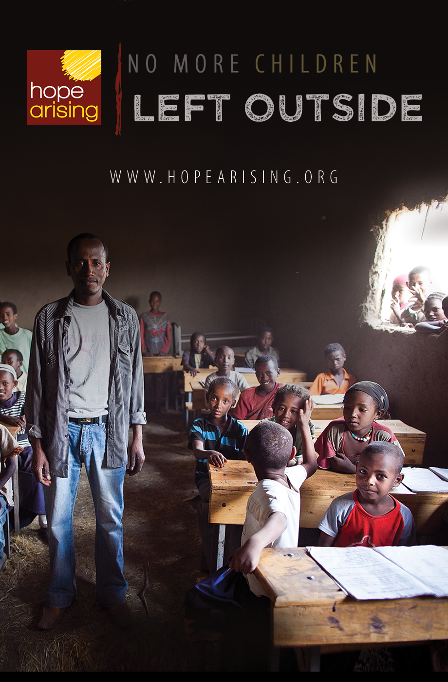
Hope Arising is a non-profit organization that focuses on helping the town of Dera, Ethiopia. They take travel teams to Dera twice a year to provide, medical, dental and general health care there in the town. On top of that, they have a team of people working year-round in Ethiopia and the USA run their microloan program. This microloan program trains moms in Ethiopia to start their own businesses and provides them with small, low-interest loans to get started.
I approached one of the co-founders, Chantal Carr, for an opportunity to re-do their website. They had a volunteer programmer build them a website a while ago, but he coded it himself and they could not change anything on the site without him. He got to busy to help out, so they switched it to a WordPress theme and did not know how to do as much with it. So I signed on as a volunteer to help with their website and will also be traveling with them in April of 2020.
Problem Statement
Hope Arising has very unique messaging that is hard to explain easily and quickly. After talking with the founder, it is clear that the microloans are her highest priority. She prefers to focus on the microloans because she believes this will lead to lasting change in the area. The travel teams are flashier to volunteers because it is something easy they can do, but she really needs more donors to support the microloan. Essentially, she wants the website to accomplish two main goals:
- Encourage donors to donate to the organization and the microloan program
- Help travel team volunteers sign up as quickly and painlessly as possible take the burden off her and her managing staff as possible.
As I glanced over the website, I decided to focus on developing a sign-up process on the website for volunteers because it is currently done through a printable pdf packet that is sent through email. Also, I want to clean up the messaging and professionalism to increase donations.
My Role
As a volunteer for Hope Arising, I worked alone on the UX design for the website. For this project, I acted as the: Researcher, UX Designer, UI Designer, and WordPress Developer. I consulted with the founder on deliverables and a lot of the content for the site came from her as well.

Empathize
I started the qualitative research by interviewing three different volunteers. One interviewee had already gone with a travel team before. Another was going for the first time this April and the last is attending a similar trip with another non-profit organization.
My assumptions were that they found and chose the trip they were going on from word of mouth. This turned out to be essentially correct as each of them had heard about it from a family member. There are a lot of pain points that were brought up with their sign-up processes. The website is essentially not involved.
Going to Africa for a week is a big decision and the amount of information you need is substantial. There are so many things that needed to be coordinated that are essentially done over the phone or at informational events. Each interviewee mentioned them or their parents talking about it over the phone with a volunteer recruiter.
Define
Why: Hope Arising values education of children above all else because it is the key to helping others out of poverty.
Problem: There are several people in third world countries that are in debilitating poverty, which causes their children to miss school.
Solution: The Microloan process that Hope Arising has developed is uniquely equipped and adjusted to develop areas of extreme poverty.
What: The website needs to convey this message in a simple way while still building enough interest to gain more volunteers and donors. As a result, the donation and volunteer sign-up processes have to be very intuitive and easy to cater to all different screens, demographics, and users that might be interested.
I created a persona based on my interviews and then worked out an information architecture so I could see how the website would flow. My initial research showed me that I needed to focus the bulk of my time on improving the travel team volunteer sign-up process for this part of the project. I plan to come back later and focus on donations once the sign-up process is finished. As a result, I spent a lot of time on the flow of a volunteer to see how they would interact with every page of the website and have a seamless interaction through the sign-up.
Ideate
Initial layouts were focused on their home page. I wanted to figure out the best way to introduce the organization in a simple way yet still explain their complex organization. However, after testing out some of the ideas with some of their volunteers, I realized that users needed information and answers to their questions as quickly as possible. An FAQ page was essential and then I really started to try and figure out the signup process. I study several competitors and general sign-up forms to get a good sense of what would make it a good experience for the users.
Prototype
I decided that their website needs a super simple sign-up sheet that needed to be integrated with their mailing lists on MailChimp. This would help their volunteers get involved as easily and seamlessly as possible instead of the current process which required volunteers to request a copy of a PDF packet they had to fill out. Now, they can sign up to be a volunteer on the website. This will help Hope Arising reach their goals of getting more volunteers by simplifying the signup process.
Test
Hope Arising is launching the website in stages as the content is approved. I have been monitoring their google analytics account and as the new design is launched I will be checking for changes in organic sessions and users. I will make any adjustments I need to make to help grow their traffic. Another important metric I will follow is Session Duration. Alongside this statistic, I will run some user tests to see what users to find how I can help solve any problems that may be preventing users from staying on the site longer.
What I Learned
This project was challenging because I had to adapt my designs when I actually built out the website because I was also developing it and my skills are limited. I also had to learn WordPress on my own and look things up so there was definitely a lot of learning that took place. Also, working for a non-profit is very much like a start-up mentality because they really don’t have anybody doing things like taking pictures or videos that would help a site like this. So in April, I will be attending a trip and have been learning photography and videography basics to help them get some more assets for their website. This project has become an ongoing side project for me and in the future, I will continue to apply what I learn about design and development to help this amazing organization continue to grow.
Update
I am now a continued volunteer and currently manage their WordPress site. I have learned countless things from this project and will do more case studies about their site as well.

