Background
In our world today, it has become increasingly common for single mothers to bear the burden of raising children. According to the census report, 23% of children are raised by a single mother. Raising kids on your own often forces single parents to be the sole provider and this places a significant financial burden on them. For this project, we decided to do something to help these brave women improve their situation by finding better employment.
Problem Statement
The goal of this project is to help single mothers find better employment opportunities. The problem is, single moms are not usually well educated as many of them never planned on having a career. They require flexibility because raising children alone leaves them with extremely busy schedules. So we had to find a way to increase their employment opportunities while also making them more employable and saving them as much time as possible.
My Role
During this project, I worked as one of the researchers that interviewed our users. I was a part of all the user testing and surveys. Also, I wireframed a lot on the site. As a result, a lot of the solutions we used in our final wireframes came from some of the wireframes I made during the ideation process. Lastly, after the assignment was over, I continued working on it. This is when I named the site and designed the logo as well.

Empathize
We did 7 different interviews with single mothers to figure out how we can help with this rising epidemic. I learned these women were impressive superheroes. While they struggled through hard times, they reflected on their experiences with pride. They developed close personal relationships with their kids that they would not trade for the world.
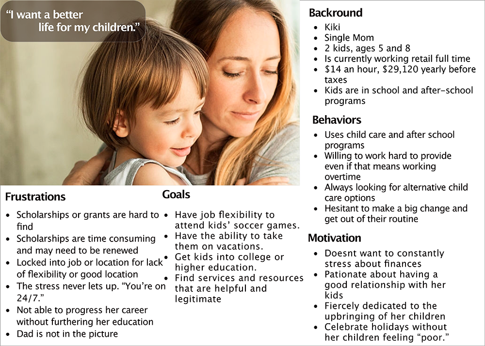
My heart broke as I heard their dignified humility in recounting their experiences and our group was fired up to help them achieve the employment opportunities they deserve. I think this deep connection to the user really helped our group focus throughout the project. We built an empathy map to help us get in the mind of these moms and focus our design decisions on them. From this empathy map, we crafted the persona shown below.
Define
To start off, we did some initial interviews with single moms we found through social media. Then we built this persona to help us personalize the issues single moms faced. We realized single moms were fiercely devoted to their children and had the motivation to give their children a better life than they had. This was an important part of their driving motivation.
They would do whatever it takes for their kids but their time was extremely valuable. As a sole parent, they have to provide and nurture their kids and bare all the decision making responsibility. As a result, we would need to build something that was easy to figure out and use.
With this in mind, we focused on saving time and simplifying their decision-making process. During our research, the solution started forming as we built out our user flow and a user story map. We wanted to create a website that could help single moms get the resources they needed.
“Being a single mom, it’s exhausting. You’re on 24/7.”
Jen, Single Mother of One
Ideate
We were under a pretty small time constraint for this project, so our big problems early were that we spend too much time trying to do too much. As we built our user flows and started to build wireframes, we realized that we were trying to do too many things for our moms. So I learned that we needed to focus specifically on the minimum viable product(MVP).
As a result, we shifted to building out the unique selling points that separated us from any other service. These two things are:
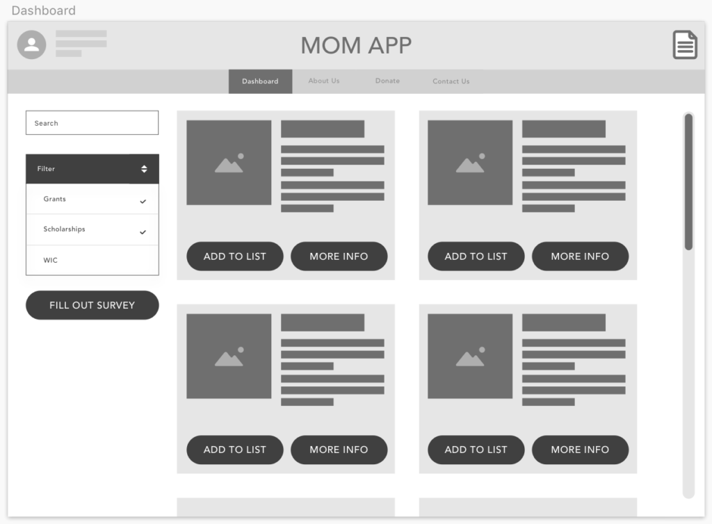
- Providing recommended resources based on what the user qualifies for; simplifying their research process and guiding them directly to scholarships, grants, and services that will help them.
- Allowing the user to quickly apply to several different helpful resources at once to cut down the time it takes to apply.
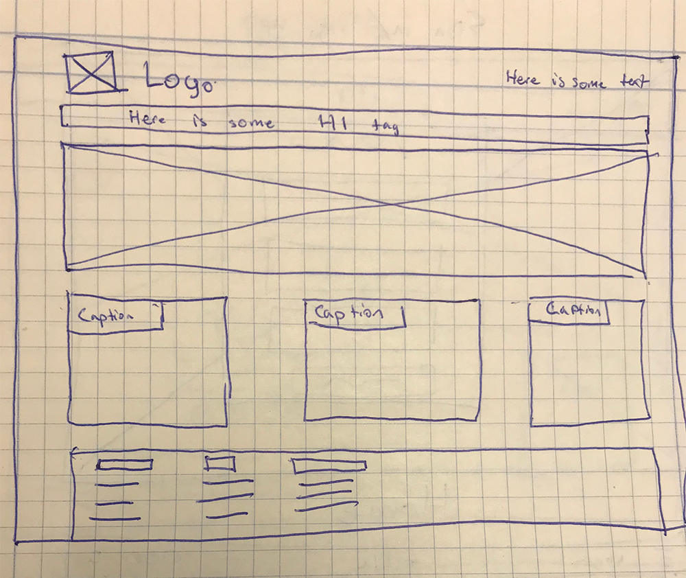
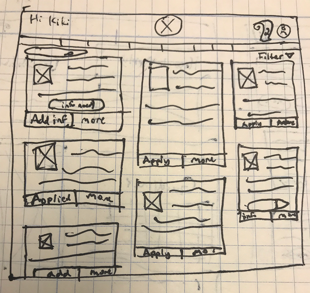
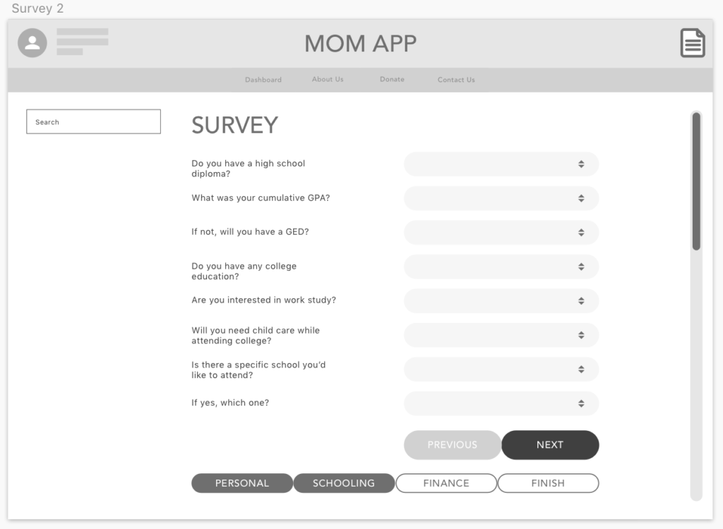
Pictured below is one of our initial wireframes that I drew out based on ideas we talked out as we discussed how this would look. Essentially, they would take a quiz that would collect all the information needed to apply for any resource they might need (scholarships, government assistance, reimbursement programs, etc.).
Prototype
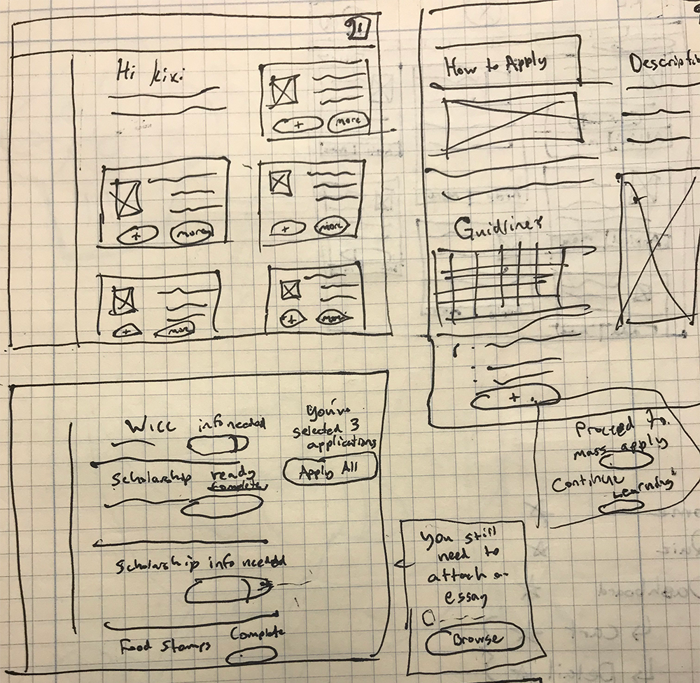
Once we established our basic services, this part became very fluid. We decided to set up the application process using two mental models.
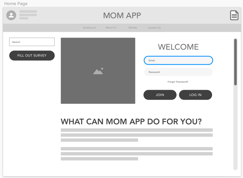
The first, a survey/quiz that pulled their personal information needed to fill out the applications. Similar to surveys they might have taken to find out their spirit animal, this would be a fun way to pull their information that will later auto-populate their applications for resources.
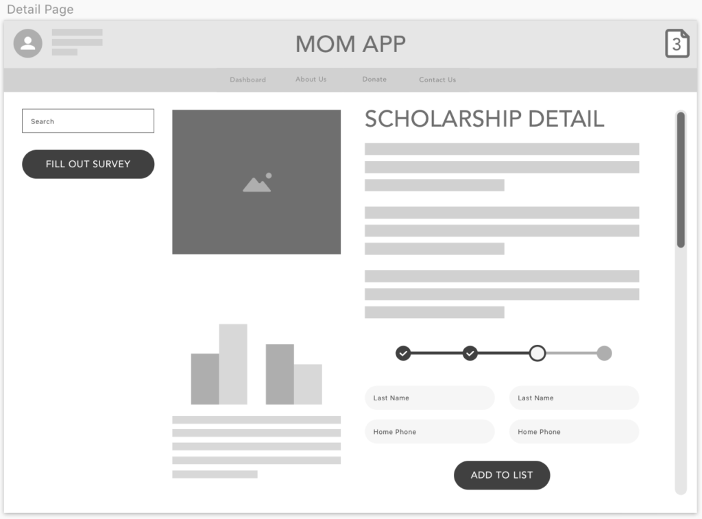
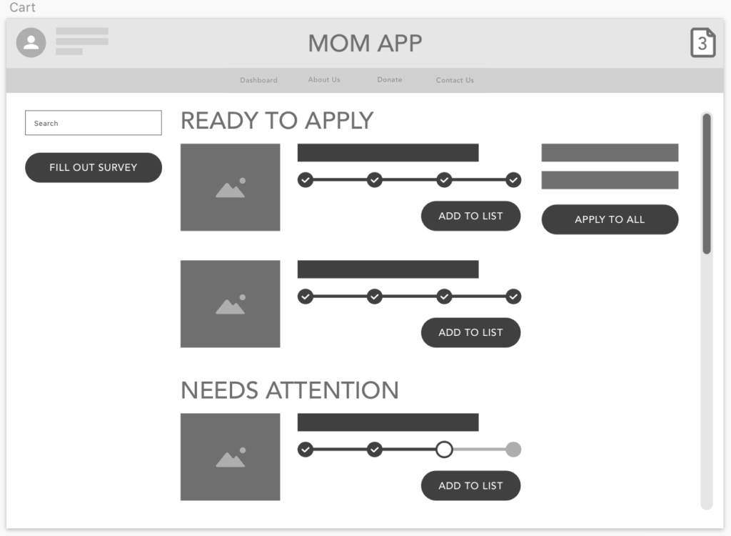
Second, we made the application process seem like an online shopping experience to allow them to simply find and choose the resources they wished to apply to. We wanted to give them the option to apply to several applications at a time or just one and the shopping cart system seemed to be the easiest way to accomplish this.
Initial reactions from users to our wireframes gave us some good insights. One thing was mentioned that if the quiz was a crucial part of the users’ experience, we needed to display it more prominently and often to show this was something we really needed the users to do. As a result, we decided to make the rest of the site off-limits to those who haven’t taken the quiz and created a profile. Everything on the site before that would just explain the process and answer questions about why they should take the quiz.
“You work so hard on your kids, you forget to take care of yourself.”
Rebecca, Single Mother of 2
Test
We tested our wireframes out by putting them in front of our mentors and users from our initial interviews. We used a clickable prototype build through InVision.
Their feedback ended up changing the entire design of the site. Originally, we had a sidebar where moms could look up their services on their own. However, when we presented this, users preferred a simple interface that focused on the recommended services.
The idea to build out the applications as a shopping cart like model came from one of our mentors as we were testing a wireframe. So in the end, we learned that there were a lot of ideas that we were super close to, that others were able to point out for us.
We also decided that we needed to focus solely on college scholarships. We did some research on the requirements and things needed for applying for government assistance, and because of security protocols involved with verifying identification, it was implausible to pursue this. So our final product will be just focused on the scholarships, which cleared up a lot of confusion about what the service actually did. By focusing down to just scholarships, our entire product became a lot simpler and easier to understand.
What I Learned
The biggest thing I learned from this project in regards to the UX process was how to adjust your project based on feedback. As we went through, we got a lot of really helpful feedback that really influenced the final design that we turned in. As we presented our wireframes, we used the feedback to arrive at the final design decisions that were most impactful. So in the end, we did not really come up with the ideas but putting wireframes and ideas in front of users and clients is where UX design thrives.