Background
When you hear the phrase handyman, what comes to mind? Our team believes that several people have been blessed with the ability to tinker. So we asked ourselves, is there a market out there where we can put these Jack of All Trades to work.
Problem Statement
The problem is that homeowners without the skills to fix small things in their house are looking for the right people to hire, while contractors charge them an arm and a leg for making them come out for a job that doesn’t take very long to do. A lot of contractors are not interested in doing these small jobs and the jobs require more time and energy then they are willing to give.
My Role
I was a big part of the research. I did 2 initial interviews and then built the survey we sent out through social media.
I championed the consumer side of the app. We collaborated on the information architecture, but I specifically researched and designed everything users will see when trying to hire a handyman. Handymen using the app will see the ‘pro’ side of the app designed by my teammates. I also designed the logo.
Empathize
We started off with some qualitative research to validate some of our assumptions. One of our initial assumptions was that people might not trust our people inside their homes. Our interviews proved this was not the case, and that overall homeowners were trusting as long as they had a company that they worked for. We also wanted to figure out how often handymen used technology and if there was a legitimate market for this product. We got a positive reaction to the idea of an app and decided to do some quantitative research to have some data to prove it.
We sent out a qualifying survey, and found that people needed this app for jobs around the house that they don’t know how to do, and would pay for it. For example, hardly anyone would pay for painting or assembling furniture because they felt they could do it themselves. However, a majority of them said they would pay for someone to install fixtures and make interior home repairs, as well as a few other handy jobs they were not able to do themselves.
Of the people who said they had work that needed to be done around the house, 77% said they would pay for it, 60% felt comfortable using an app to hire them and 22% said maybe. So we concluded that there are definitely people willing to use this app to get things done around their house.
There was definitely a market of people who knew how to do these jobs as well. So we wanted to create a way for these handymen to get some quick extra work as simply as possible, yet making it as easy and as painless for the consumer.
Define
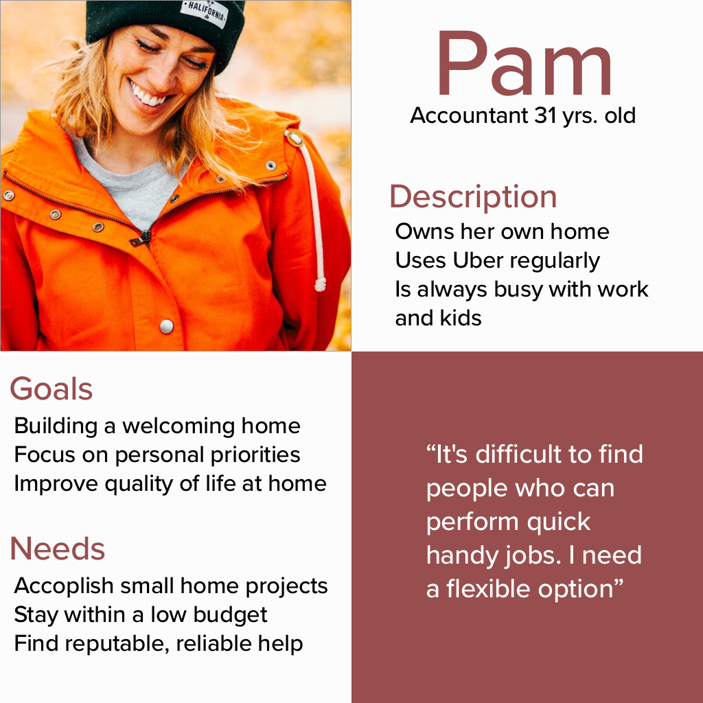
We decided we had two target consumers. One was what we deemed the pro side. These were the handymen that wanted to pick up some extra work on the side. They’re motivated by a desire to help people with their hands.
The second target was the consumer, the homeowner who needs some work done. They are motivated by their time and life spent with their family. They are trying to improve their living space.
As a result of having two target personas, we realized we would need two different sides of the app. A pro side for being hired out to go work different jobs, and a consumer side.
Ideate
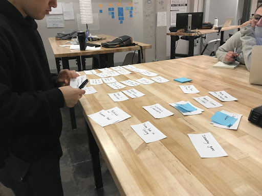
When we did our card sort, we were trying to figure out how to categorize the types of jobs so that people could find them easily. We realized that people associate the work they need to be done based on the room the job was in and not the type of job. So we decided to build out our categories for the consumers based on rooms. After this, I created a sitemap for what the consumer side might look like.
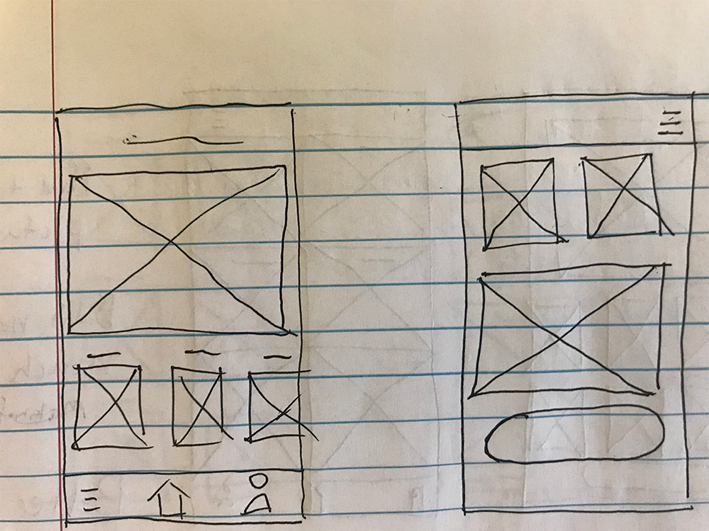
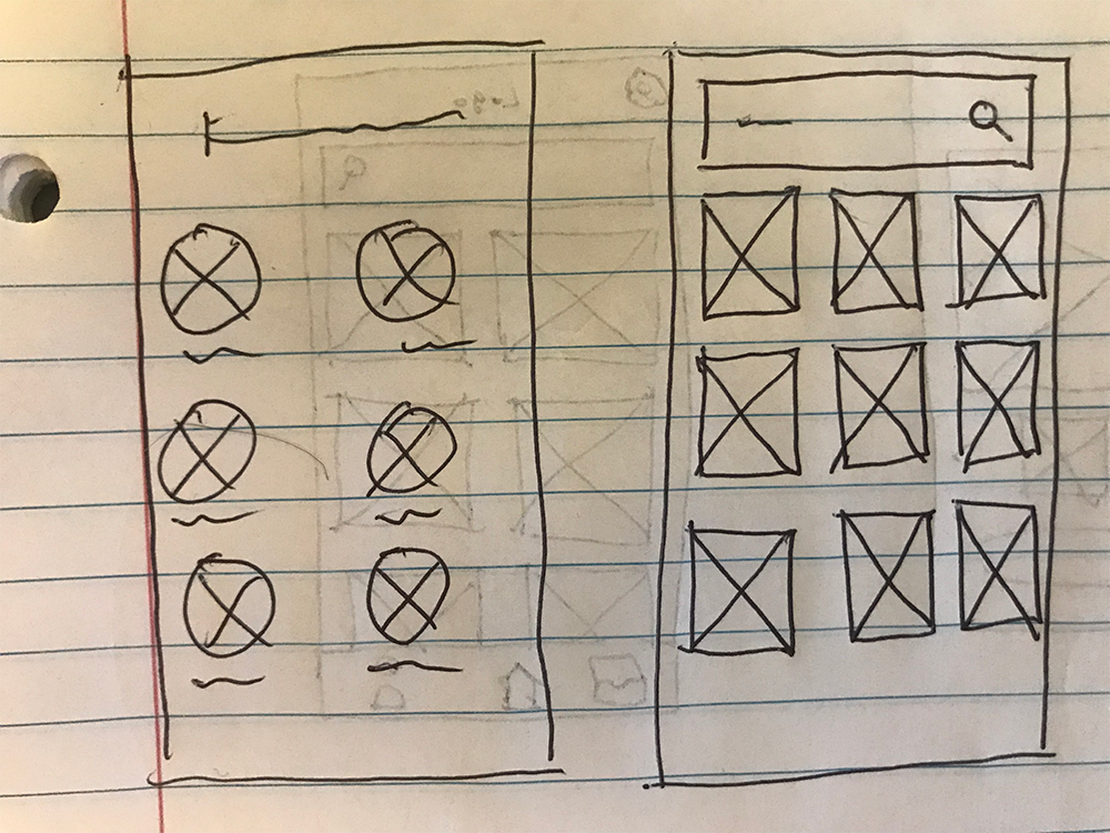
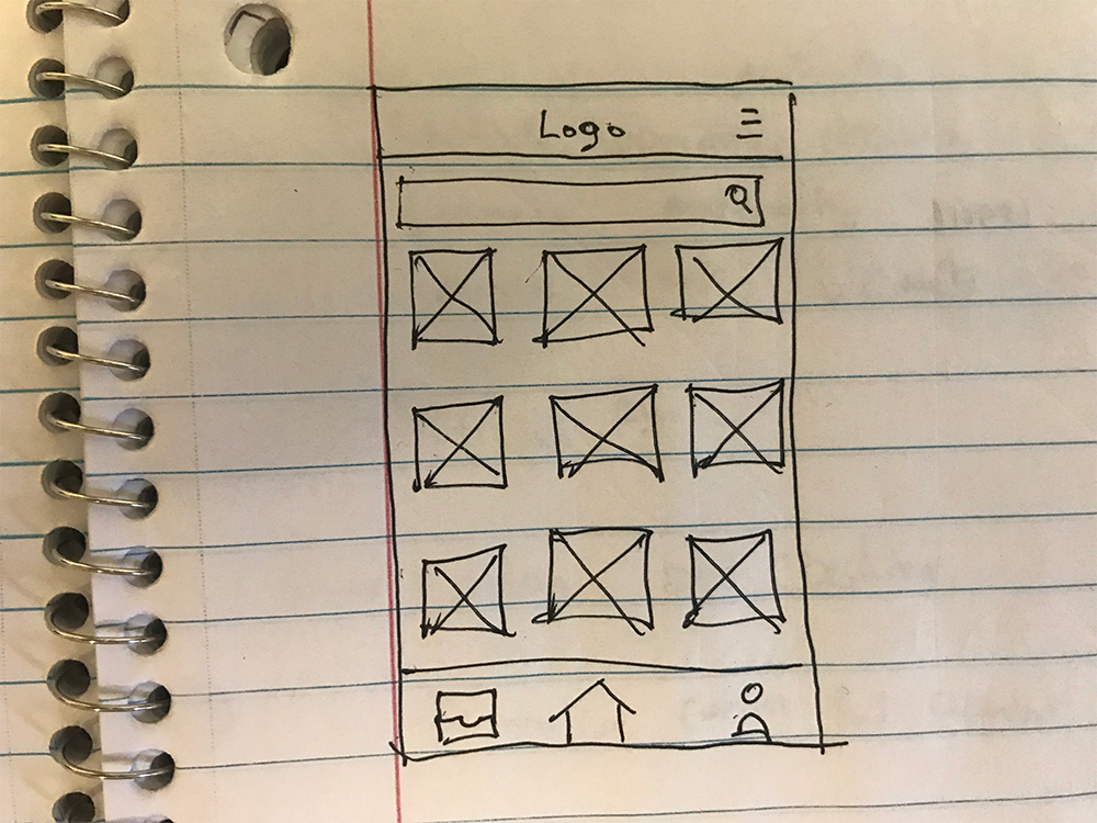
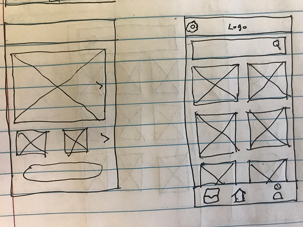
During the initial wireframes, we struggled to decide how to schedule the work. We weren’t sure if it would be better for them to do an uber-model and hire the next available handyman, or to schedule it in advance and have our software assign them a Jack employee. There was also a conflict between whether or not the consumer could pick which pro.
After presenting some of our initial wireframes to users, I decided to give consumers fewer options in selecting pros to improve the simplicity of the app. Users who looked at the wireframes already assumed they would schedule the tasks in advance and responded that they would almost never use a feature to hire the next available person. The consumer can schedule a task for a specific day and time. However, users said they would like to know about the pro before they come to the house. So to compromise we gave the consumers an option to favorite pros they have worked with before, and those employees would be sent to them first if they were available.
Prototype
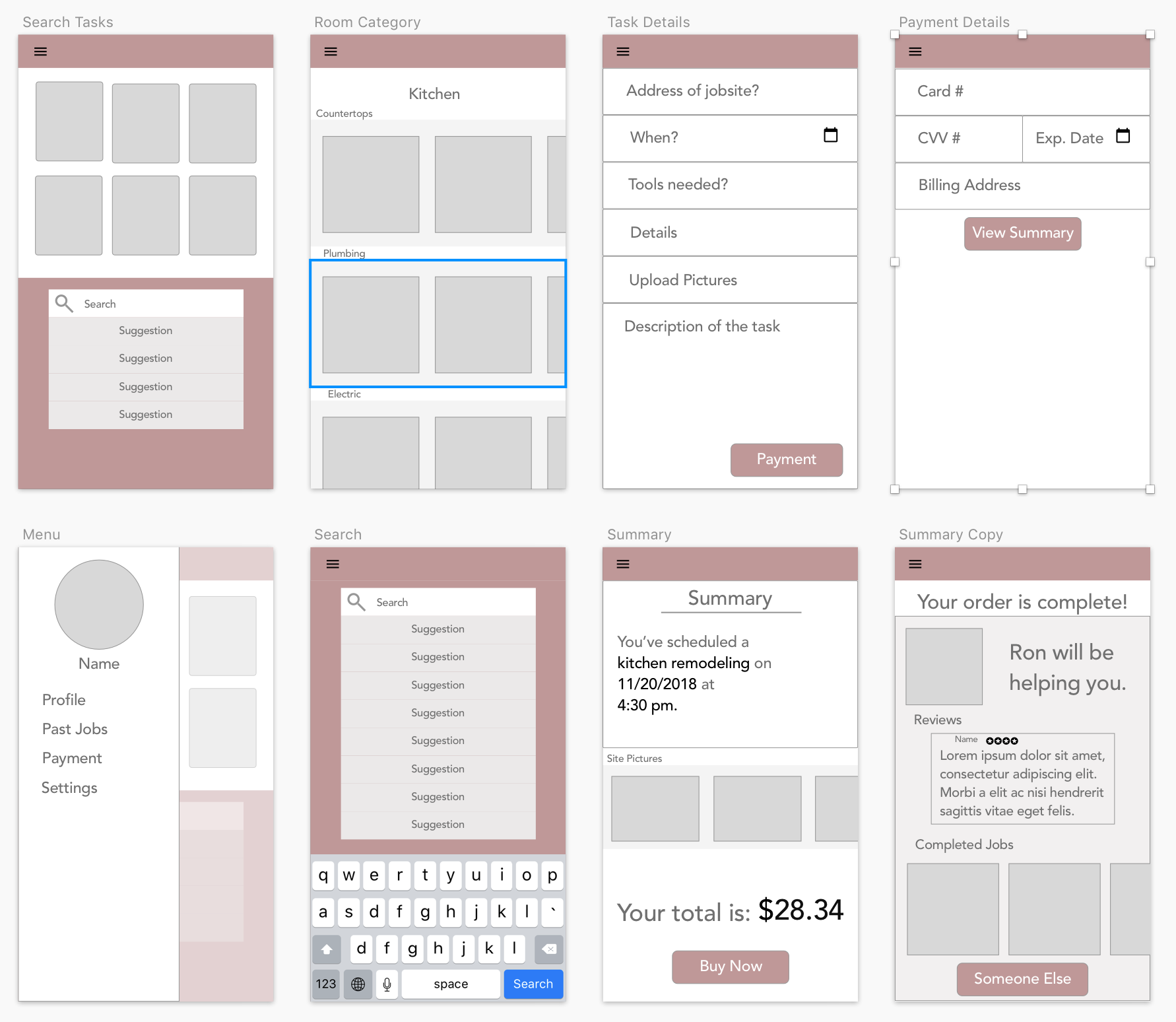
Test
With our initial feedback for our first wireframes, we realized that users wanted to see the pros more and be able to know who they are. So we decided to add a section to view handymen in their area and their schedule so users could favorite the handymen they like. This way, we will send a specific person if they have a preference.
Key Learning
This project was a really interesting learning experience for me because I really did not believe the need for this app existed. However, through our research, we found that there is a market out there for this kind of an app.
Similarly, we really learned the difficulties of several designers working on a project. We created a style guide at the beginning, but were not thorough enough and ended up with three different designs that looked slightly different. If we had more time, I would have made the style of the app more consistent across the different sides (ie: Onboarding, Pro, and Consumer).
