Our client, Gemtrain, was a company that created courses for parents of autistic children. These courses helped parents to learn better techniques and strategies for helping their children to thrive.
I acted as a consultant for the User Experience of their website.
Problems:
When they approached us, they had two major problems.
- The courses were very difficult to get through. They had some initial beta members trying out their courses and the feedback across the board was that they were not easy to get through.
- They were reporting very low sales for their courses and were struggling to make their returns.
A Simple Course
So as I worked through their system for the courses I noticed that they had some key areas they were struggling on.
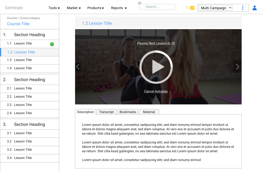
The course player itself was difficult to use. After one module video would end, the old system made you click on a button to show that you completed the lesson, then you had to click on the next lesson to continue through the course.
This made it really easy to get frustrated because there were far too many clicks that the user had to make in order to get through the course modules. While I was not trying to implement a three-click rule, I also realized that this was probably a big reason why the people testing the courses described them as “Hard to get through.”
So auto-completed the lessons after the video finished. Then we added the next and previous buttons to the lesson page. Finally, we added an autoplay feature at the end of each lesson video with a few seconds of delay. With these improvements, we also added a transcript to many of the course modules so that they fit into more accessibility requirements.


Gamification
The next thing that made the courses difficult to finish was the lack of a way to track your progress. When a user would log in, there was no way to see what courses they had enrolled in and how far along they were in each course.
This was the biggest grievance for our users because unless they finished the course in one entire sitting, it was difficult to find their spot again and pick up where they left off.
This was such a missed opportunity that I designed a gamification system that used a user login. This means each user had a dashboard where they could view all of their courses and build a gamification type of progress tracker that would reward them for reaching different percentages of completion in their courses.
This accomplishes several things. One, it provides a way for users to track their progress through the course. Two, it requires users to create accounts in order to purchase the courses. This gives us more data on the students and allows us to add to a marketing list for promoting other courses and potential future products on the site. Lastly, it develops motivates them to keep pushing forward in their course and finish the material so that they can get the entire value out of their purchase.
When to Require Emails
I got some pushback at this point because the implementation of this feature would require anyone to create an account before they could purchase anything from Gemtrain. Before, they had wanted to prevent this because they were trying to eliminate barriers for the user.
This seems like a significant barrier, but it adds a certain level of exclusivity and commitment when you are required to give an email address or create an account.
On top of that, it is well established by some of the biggest e-commerce stores that emails are a part of an online transaction. Therefore, this does not violate the UX Design principle of familiarity. Around the internet, it is well established that if you are paying money to a website you will probably have to give an email address at the very least. In fact, other popular course websites like LinkedIn Learning, Udemy, and Skillshare all require accounts before a user can enroll or pay for a course. Also, there are entire websites like https://www.zulily.com/ that prevent you from even shopping on their site without creating an account.
So we decided that we would allow users without an account to preview the first few lessons of the course without giving their email. However, once they viewed these teaser lessons, they were forced to create an account and enroll in the course in order to continue watching the videos. This allowed them to view the course with limited barriers, and hopefully be ready to buy at that point in the course.
Checkout Process
The next thing that I tackled in my design was the checkout process. I examined the analytics and noticed that there was a big dropoff during the checkout process and a lot of abandoned carts.
I believe that the reason for this was that Gemtrain had two different checkouts. One for the purchase of an individual course (like Udemy), and one for a monthly membership that gives you access to all the courses on the site (like LinkedIn Learning). This created a problem because it became too confusing at certain points to know what the user was paying for.
I would test the process with users and they would say, “I don’t know whether I am buying this course or signing up for a monthly course.” They would abandon their purchase because of this and didn’t really take the time to look into it.
So I convinced them to go to just selling the courses individually. That way, we can gain money off of the individual courses. Each teacher had a following and would advertise their course on our site so we could capture some profit from their following without forcing them to buy a monthly membership.
Marketing and Branding
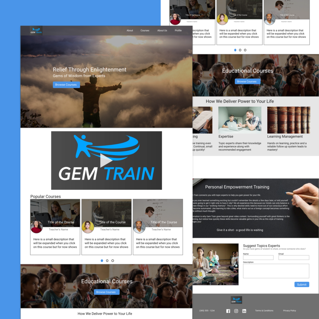
This section is all about how to sell the courses. Originally, Gemtrain just wanted to make videos with gems of wisdom. After going through their site, we realized that a lot of their videos were geared towards parents of children with autism. We talked about it and decided they needed to rebrand their home page and courses to focus on this. I then redesigned their home page to focus on selling their brand.
This included writing the copy that was used and laying out the website to conform to the story brand approach. This approach was requested by the owner. Essentially, we build the website to make sure the user knows exactly what you do as early as possible and then leads them through a story about the brand where the user is the hero and Gemtrain is a guide.
Results
As a result of all of these changes, Gemtrain started to see its first sales. Before this, only beta testers had taken the courses, and the owner had let them enroll for free. Now they started making some actual sales on their courses and this was a really exciting phase for them.
However, there was still a lot that they needed to work on. Originally, they had only asked for my opinions on the designs and the layout of things. They hadn’t considered that there might have been other problems. After a few months of this, they asked me my opinion on why their business was not profitable and I explained something to them that made them pivot their entire business model.
In my opinion, their courses were too cheap. They put a lot of time into each of these courses and to sell them that cheap would not recoup enough of their costs. The reason they were being sold that cheap is because they were not courses at all. Instead, they were interviews that would have worked better as a podcast episode or youtube video. After watching a few of their courses, I noticed that they seemed more like a podcast then a traditional course because it felt more like conversations then course modules.
After I explained to them the ways in which they could monetize a podcast, we created a plan to pivot some of their material over to podcast episodes. They are currently in the process of working on this overhaul and trying to monetize their podcast as well as continue to build traffic to their site.
What I Learned
I learned a ton from working on this project. First, I learned about the story brand approach which gave me some great practice and skills in designing landing pages that convert. This was probably one of the most valuable takeaways that I will use throughout my career. I also learned a ton about starting an entirely online business.
Second, it is usually better to build an audience before selling products to them. Once you have your audience built, you will better know the services and products that will appeal to them. Gemtrain created courses hoping the audience would want them, only to find out that they weren’t all that interested and the courses weren’t exactly courses.
Lastly, it is vital to get your business model right. A lot of times as UX designers, we focus on the design and the visual changes that we need to make. However, the best way to actually improve the users experience might be to make a slight change to the product or business model to provide a value to the users in a better way.