Background
SideCoach is a company whose mission is to eliminate the gap between young athletes and high-quality coaching. Their main product is a website that connects athletes directly to coaches within their sport. Athletes are able to request personalized videos and advice from coaches through the website.
I joined SideCoach just before launch as their first UX Designer and it was a daunting responsibility in which I learned a ton about design, startups, User Experiences, and myself.
Problem Statement
When I started working, I made it my first priority to understand the product they had built and what problem they were trying to solve. The problem statement is, athletes need better access to coaches. Top-tier coaches are hard to find and extremely expensive when you do find them. This project hit home to me because my dad was a volleyball coach. When I was growing up, the kids who wanted to play volleyball would pay extremely expensive fees and go hours out of their way just to be on a club team with a good coach. My dad went out of his way to reach out to underserved kids in the area and lower his fees so they could afford to play club volleyball. As a result, I immediately felt connected to the problem we were trying to solve thanks to my dad’s example.
Competitive athletes need a way to find coaches that can help improve their skills but are still affordable. They don’t just need affordable, it also needs to fit into their busy schedules. So we set out to learn how we can provide access to coaches while making it affordable to the players and profitable for the coach’s time.
My Role
I was hired on to work as a UX Design Consultant with SideCoach a few months before they were ready to launch. They had a team of 5 developers that had been working on the app for several months and they brought me in to help improve the look and feel of the app, as well as work out some tricky interactions that they were stuck on. So while I was there, I had the important role of being a customer advocate and introducing a design culture into the organization.
The Key Issues that needed to be solved:
- Coach requests and inbox interface
- Monetization (subscription-based model)
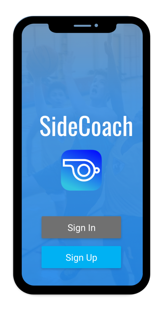
- Onboarding process
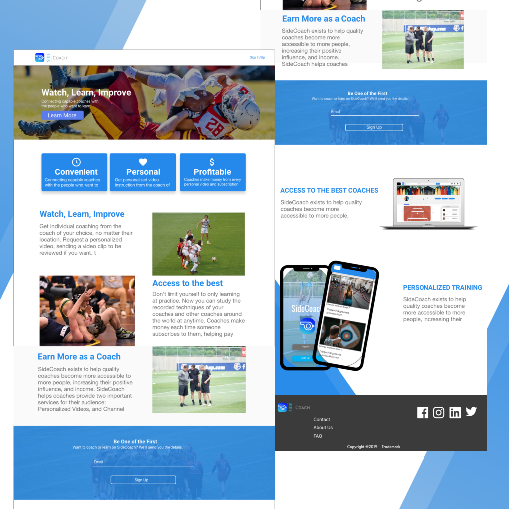
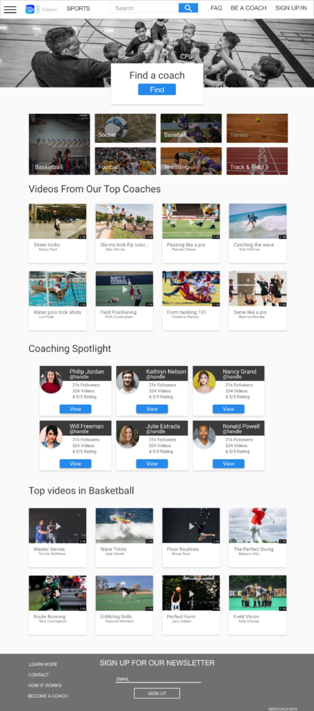
- Front page design
Empathize
The first thing I did was an inventory of everything they had built on the site until that point. Then I took a deep dive into each feature they had built because I wanted to get an understanding of where they were at and what decisions had been made. One of the first things I noticed is that they didn’t have a mobile app. When considering the problem, a mobile app seems like the quickest way to provide access to athletes. However, when I asked about it, the mobile app store charged too much for their liking and in efforts to keep it affordable, they wanted to build out the website first. Working in a startup environment, you constantly have to understand what makes sense for the user and the business.
So with this in mind, I needed to do some research to understand more about the solutions the users were looking for. I did some qualitative research and I tried to focus on the things that needed to be solved first. As I started showing mockups to a few users, I started to see a few patterns in their responses that spelled trouble for the direction of the product. These main two issues that kept users at bay were the social posts and the subscription model.
Designing by Deleting
Because the app was already pretty far along in the production process, I was in a unique and challenging position because I felt that developers were working on features and things that users didn’t really want or need, based on the research I had done. As I took note of everything they were working on, I noticed that there were two main things that were holding us up that could be resolved fairly quickly by deleting them altogether.
Posts:
The app was designed with a social component that included coaches posting and athletes commenting on those posts. This proved to be an unwanted feature as people I interviewed said they would only really want to see the videos that coaches made.
So after that, I drew up how our app would function without posts and presented it explaining that a lot of the functions the developers are struggling to build would not be as difficult if they didn’t have to run scripts to pull relevant posts in all the locations. There was some initial pushback from development because a lot of time had been spent on this feature, but ultimately we decided to completely do away with posts. Once this happened, a lot of the team started saying that the app made a lot more sense now and was more focused on solving the problems it had originally tried to solve.
Subscriptions:
Next, we had to figure out how to do the subscription model, which was something they had been trying to figure out for a while. There were a few choices: Originally they wanted to have each user subscribe to coaches individually in order to view what we called ‘regular content’ from a single coach. This refers to the generic videos the coaches were posting on a regular basis. They were not specific to any user and essentially functioned like a youtube channel that required a paid subscription.
The other option was to charge a monthly subscription to the entire site. That means that you would get access to the regular content from every coach on the site for a monthly fee. Developers were working on this for a while trying to understand how they would limit rights to each video to the people who subscribed to that video.
I tested the two of these ideas with about 10 athletes and the overall consensus was that they would not use either method. Essentially, the ‘regular content’ could just be found on youtube and the only thing they really wanted to pay for was the personalized videos.
So in a meeting with the owners, I explained the responses and stated that our biggest problem now is that we were unfocused. We spent all of our time trying to establish all of the wrong revenue channels to try and cash grab our user base before we even had one. Instead, we need to focus on our unique selling point. We need to focus on what it is that makes us unique and that was our ability to offer individual, convenient access to top tier coaching. We needed to focus on solving that one problem for the user, and that will be what people will pay for.
During the presentation, I had the project manager think up the most random sport she could think of and she said curling. Then I showed this video to illustrate that nobody would pay for the regular content from the coaches on our site when Youtube already had high-quality coaching videos on basically any sport that exists. Video Player
Almost instantly, the owners agreed that we needed to focus on the personalized video for coaches as our source of income. They had been consumed with the thoughts, ideas, and future potential of the concept of the app, that they had allowed themselves to go overboard on their pricing method. We decided that in order to launch we just needed the video delivery/inbox for the request’s user make to coaches to function properly. This way, athletes could get access to personalized coaching videos from the best coaches anywhere in the world. This is the problem we needed to solve and the solution would be what athletes would want to pay for.
Ideate
So I set out to solve the coach requests. This proved to be a lot more challenging than I originally anticipated because the development team and owners had a lot of constraints that I had to workaround. For example, my initial sketches had a sort of interactive table idea, but the developers said that this table wouldn’t function well on a mobile version. Another problem I ran into is the naming convention.
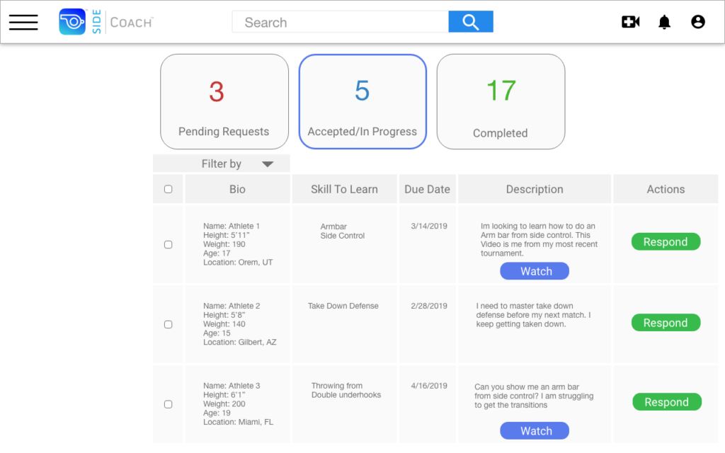
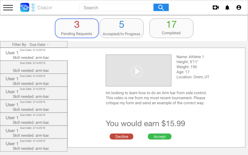
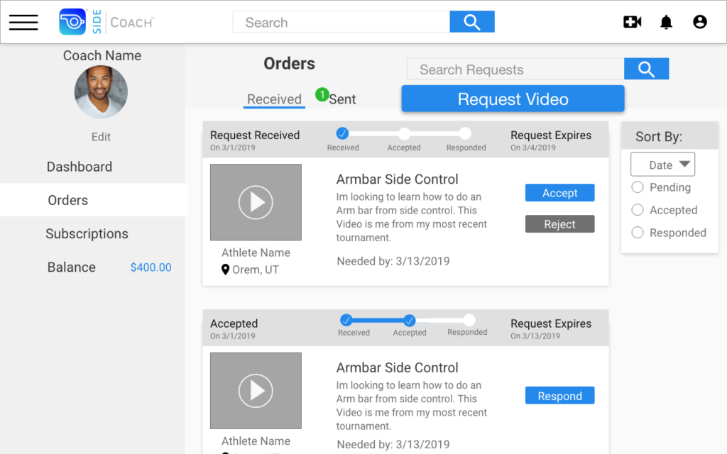
The problem with the naming of the request inbox was that a coach on our site could receive requests from athletes, but could also request videos from other coaches on the site. I thought this meant we needed two separate inboxes. An inbox for video requests from other athletes, and an inbox for video responses from other coaches. My first idea was to separate the two and call the inboxes after the recipient. Coach’s inbox and athlete’s inbox. But management did not like this distinction and felt it should all be viewed in the same place. Then I sketched out an inbox with a received and sent tab but when I showed this to users, it didn’t make as much sense as I had thought.
The idea that we finally decided on was to have one inbox, almost like an email inbox, where you can see all of your interactions with other users. Then users could filter that inbox based on what role they were acting in. This proved to be the idea that we went with because it made the most sense to our users.
Prototype
This video shows a real quick prototype of finding a coach, requesting a video and then responding to a video request. I did not get too high fidelity here because I was just using this to show developers how it would flor. For a more in-depth view, click around on the full prototype.
What I learned
I learned how important UX Design is from the outset of each project. The developers at SideCoach spent 6 to 8 months before I got there working on things that we ended up not even using. This could have saved the company a ton of time and money and it was really eye-opening to me.
Another thing I learned was the importance of user feedback in every stage of the design and development process. Without truly understanding the needs of its users, SideCoach built a product that tried to do too much and didn’t meet the needs of its users. Once that was clear, it only took us a month to launch the MVP.
Final Wireframes: